App Redesign
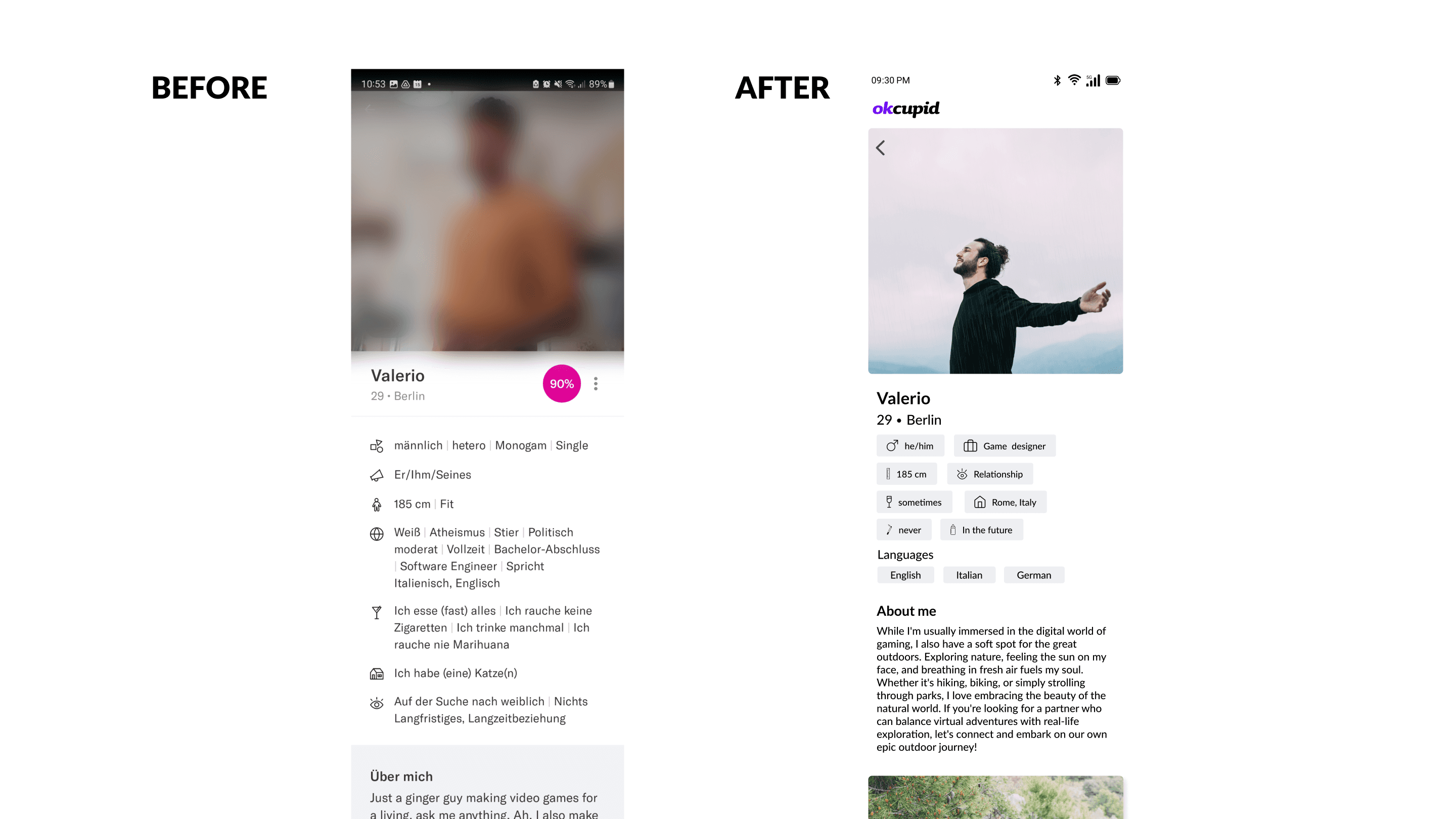
The objective of this project was to redesign the OkCupid app, focusing on improving the user interface (UI) elements and enhancing the overall user experience. The existing app was cluttered and filled with distracting elements, making it challenging for users to navigate and interact effectively.
Heuristic Analysis
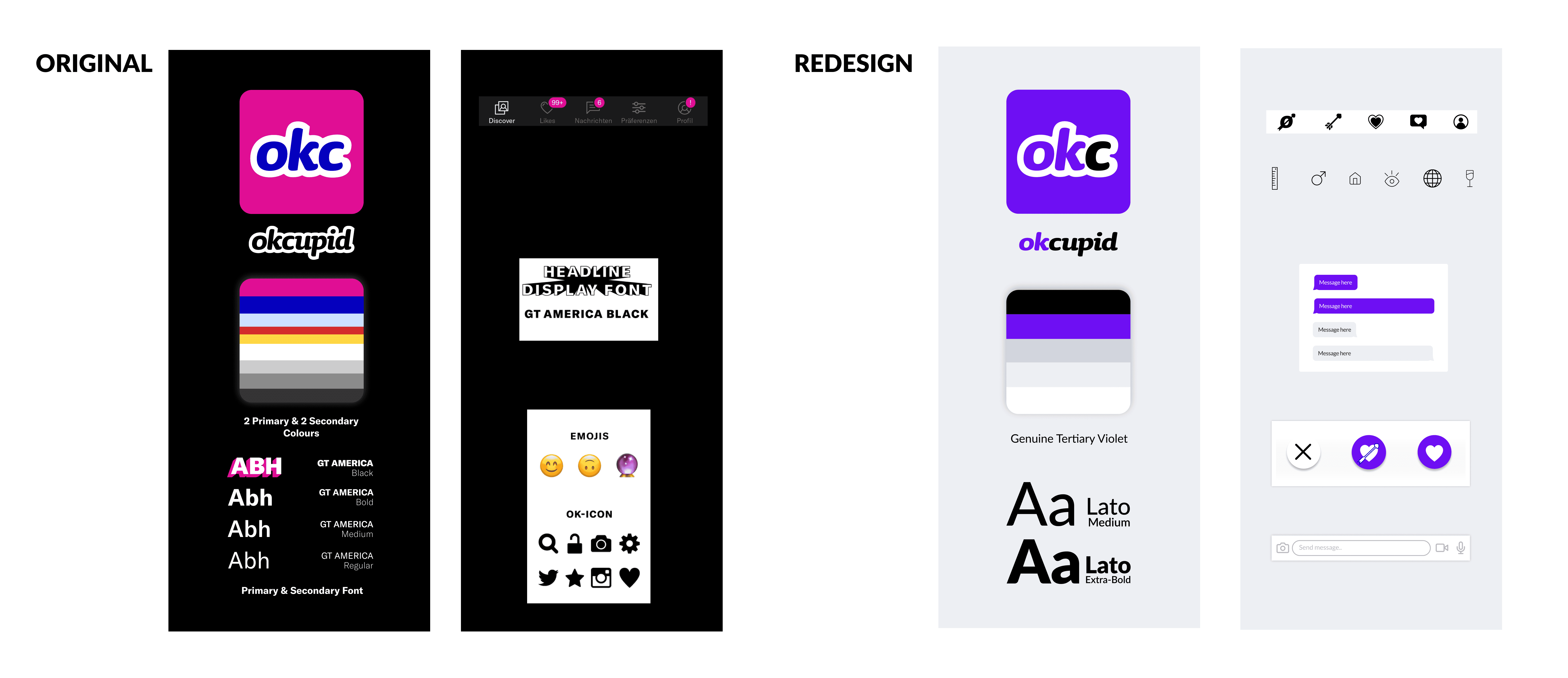
To evaluate the existing app, a heuristic analysis was performed using Nielsen’s 10 Usability Heuristics. This evaluation framework helped identify several UI issues, with the main focus being on the consistency and standard of the UI elements. The app uses two main colors, but the usage makes the app hard to use since they distract from the main point, which is the dating profile. This, in combination with a very distracting secondary font used for headlines and similar elements, overwhelms the user with visuals. These issues were causing confusion and frustration among users. The design process began with extensive research and competitive analysis.
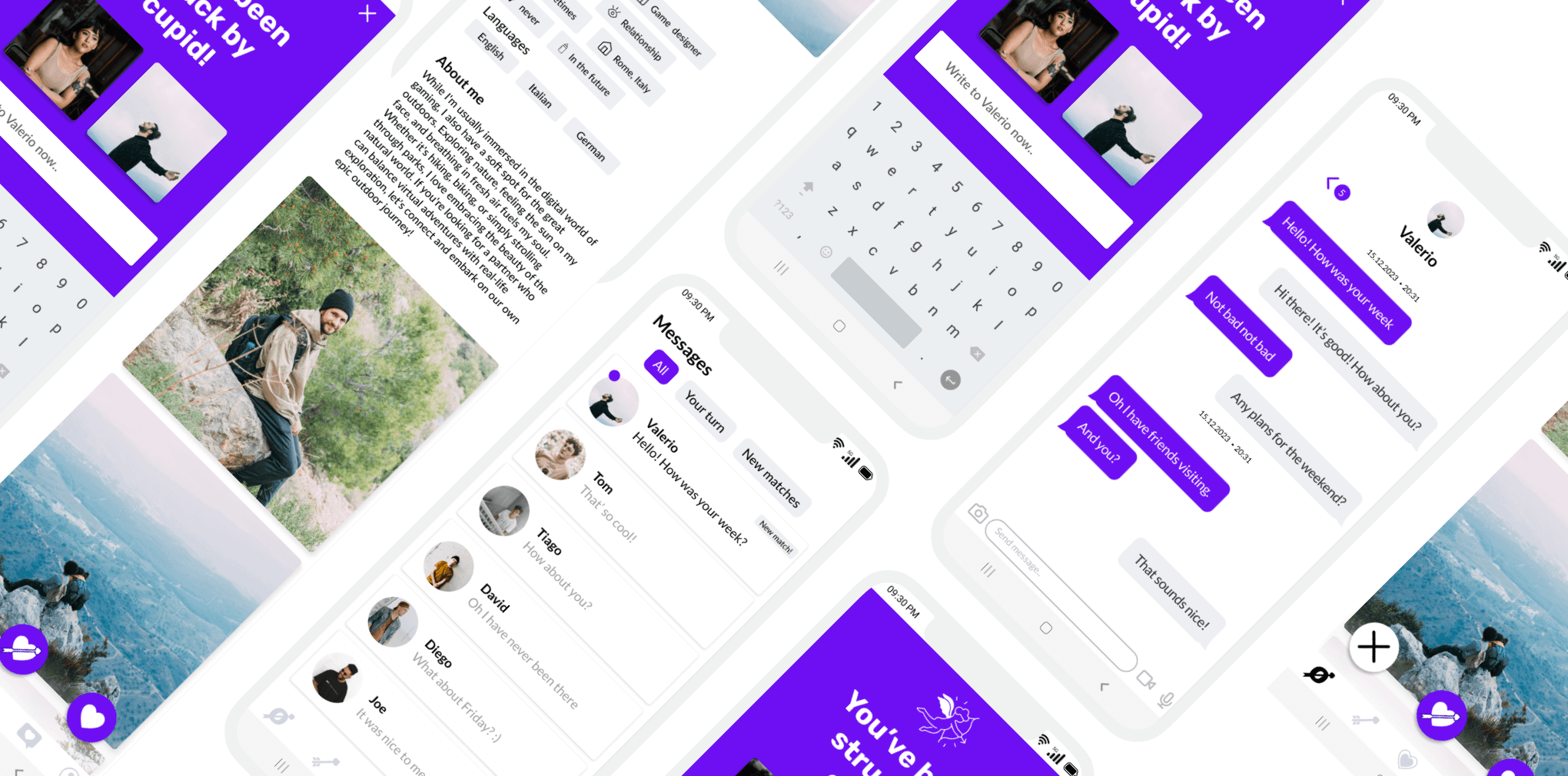
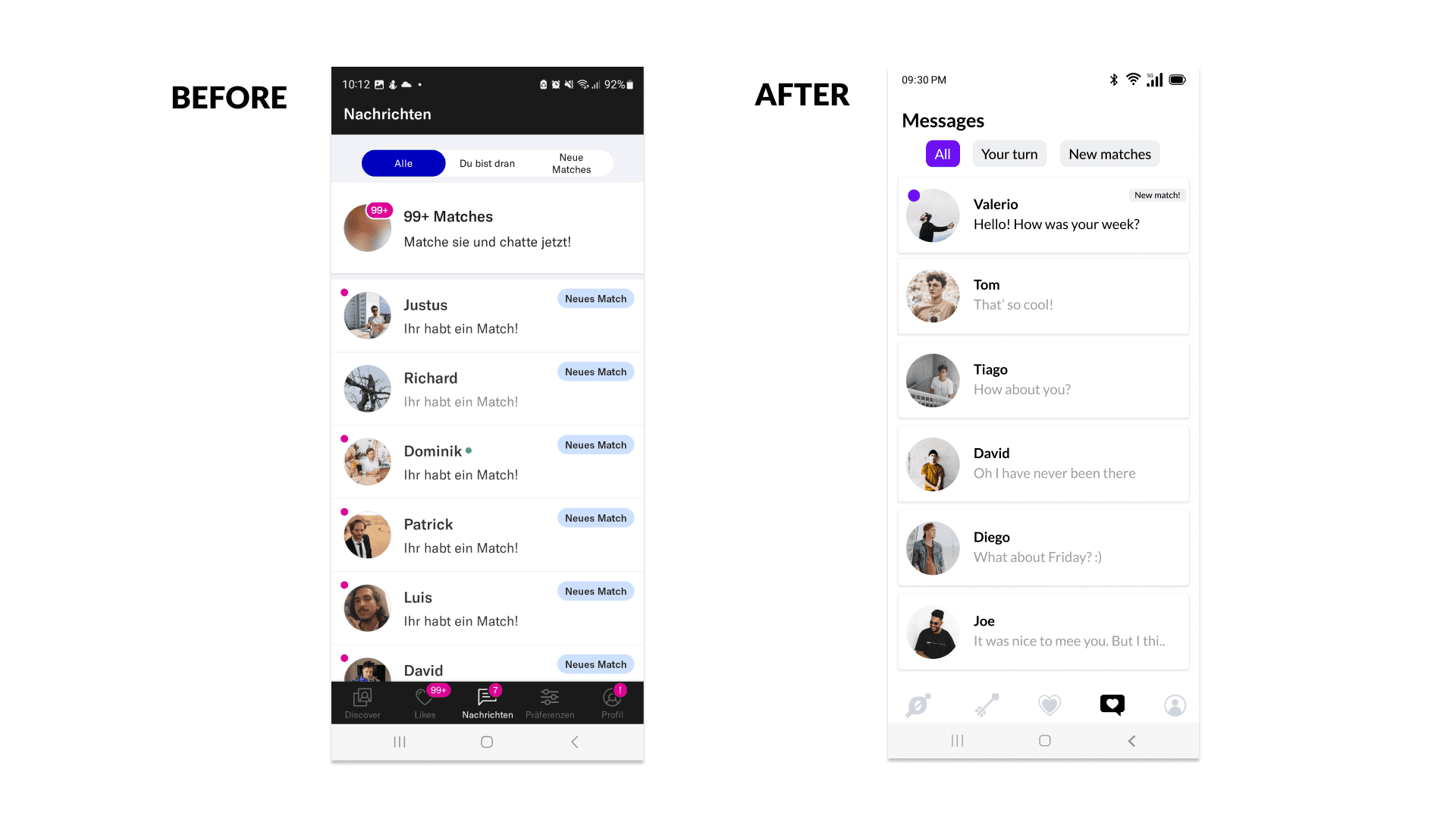
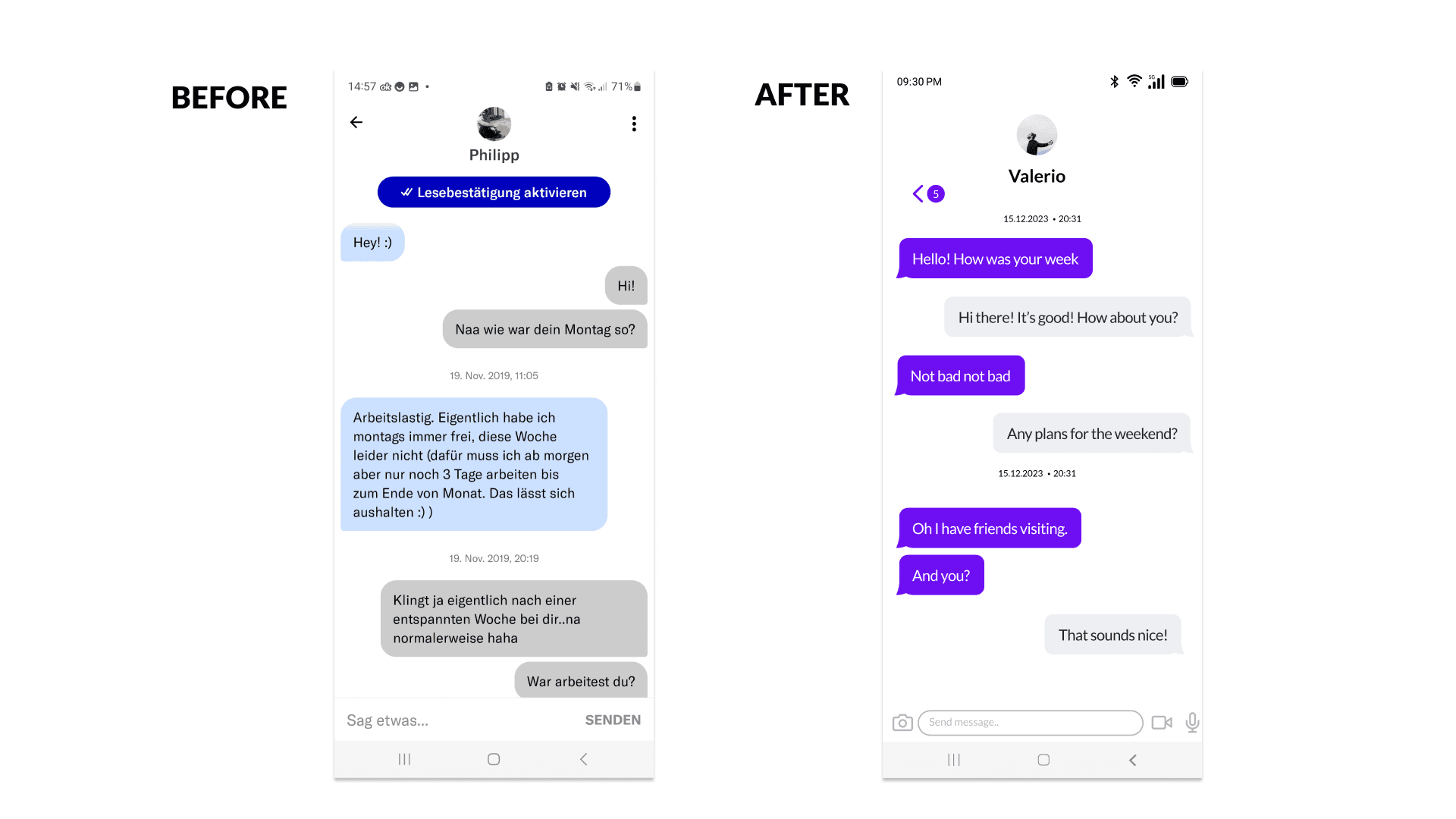
To create a cleaner and less cluttered UI, several design solutions were implemented. Firstly, visual hierarchy was established by prioritizing important elements and removing unnecessary visual noise. For this, the colors were reduced to just one main color, combined with neutral colors, to better highlight the important elements without overwhelming the user.
Design Decisions
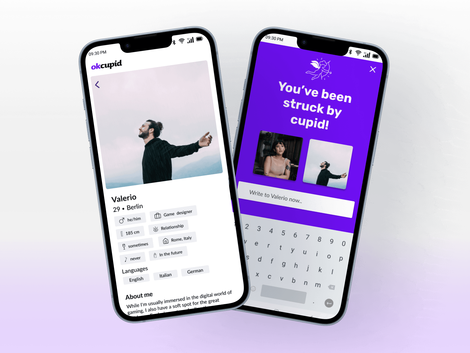
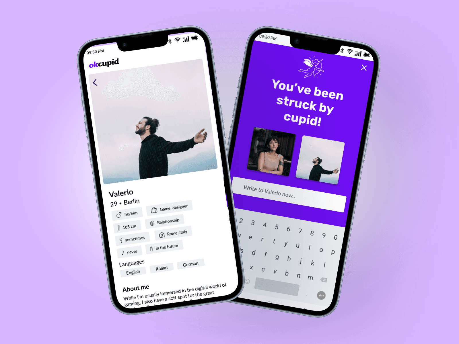
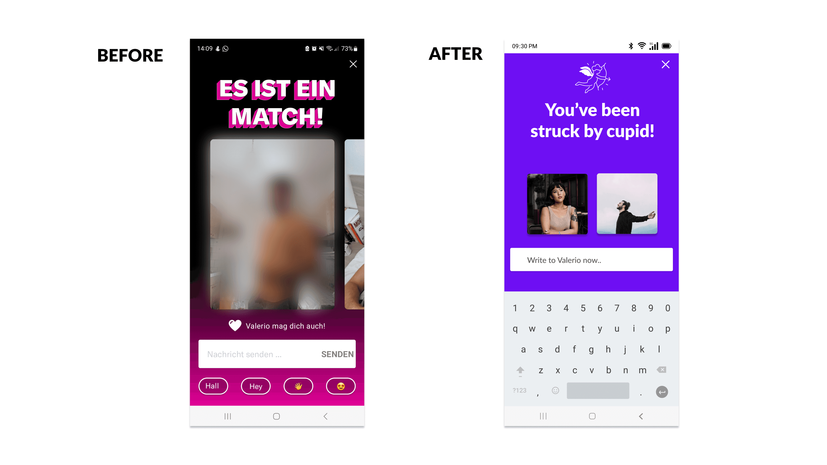
The iconography was updated using a more user-friendly design to make the icons stand out and guide the user to the pages they are looking for more easily. Lastly, information was presented in a more digestible manner, ensuring that users could focus on relevant content without feeling overwhelmed. The UI changes contributed to enhanced clarity, simplified interactions, and reduced visual distractions, resulting in improved overall usability. Finally, the concept of the app was revised. The name itself refers to Cupid, who is the god of love and is portrayed with a bow and arrow, striking bystanders and making them fall in love. This concept was never mentioned or implemented in the design. For this redesign, the concept was included in the design through the iconography as well as the copy. When you “match” with a person on the app, the headline “You have been struck by Cupid” appears.
Learnings
Through a heuristic analysis-driven redesign approach, the OkCupid app was successfully transformed into a cleaner and less cluttered platform. The project highlighted the importance of prioritizing user needs and applying UI design principles to improve usability. The redesign has the potential to significantly enhance the user experience, leading to improved engagement and satisfaction among OkCupid users.
